What are your least favorite design features of the 71-73s?

7173Mustangs.com

Help Support 7173Mustangs.com:

This site may earn a commission from merchant affiliate links, including eBay, Amazon, and others.
I did not care for the nose high look when they were new either... But other than that I love everything about them... Maybe it's from growing up with my car and it always being there that makes me feel that way... or maybe it's just the over all design of the car... I don't know

There are three things I would change... but they arent asthetics... One is the low spot in the cowls that traps and holds water when they sit out in the weather... the second is that unfortunately that area did not usually recieve any kind of paint for some reason.... and third is that my car is not restored yet...

 
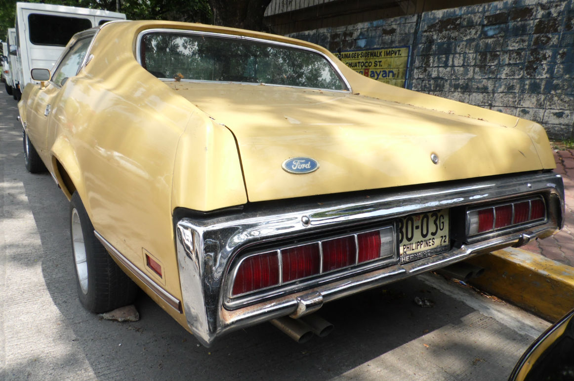
Here are a few more attempts at improving the rear of our 70s cars. Would this have been any better?

Mach%201%20b2_zpsbdmkn8qe.jpg


Or this?

Mach%201a_zpswtjs0y5c.jpg


Last edited by a moderator:
I LOVE the lights! The are unapologetically 70's and one of the hallmarks of the 'big bodies'. They look mean to me, just like the car. I like the Shelby conversion too, but I'm completely cool with the lights as-is. And what are you guys talking about you can't see out the back? Just drop the top! ;)

 
I'm diggin' this look. It's a little darker and all 3 red panels would light up sequentially and all 3 white panels would light up in reverse.

New tail light lens.jpg

 
Those are pretty cool, Don.

But I like the idea of this:

But with these taillights in the same spot:

1971-mercury-cougar3.jpg


Or these:

cougar-10.jpg


I don't have Photoshop here at work, but I think those taillights (not resized) would be awesome and fit the taillight panel like a glove - without any kind of resizing or anything.

 
Blammo! Ask and ye shall receive! One of the guys in the Facebook group "1971-1973 Mustang Owners--The Big Horse Club" did this to his car:

11248875_10204357746485869_1416368583990118194_n[1].jpg

OH, how I wish I would've thought of this when I had the back-end of mine all torn apart. ::thumb::

I think I would've left the gas filler right where it's supposed to be, and keep the license plate bracket where it should be as well... but this is SO cool.

 
That's pretty cool. Only thing I don't like is the grille over the lights which make them look like they came from a Firebird.

I don't mind Firebirds at all and I like their tail lights but not on this for some reason.

 
While the craftsmanship looks a bit rough, that looks so "right" for the back end of the car, it's ridiculous. Even the revised license tag placement complements it.

-Kurt

 
That's pretty cool. Only thing I don't like is the grille over the lights which make them look like they came from a Firebird.

I don't mind Firebirds at all and I like their tail lights but not on this for some reason.
Well, if Ford would've done that from the factory, then it would've been a different story, eh? ;)

Actually, the Cougars also had slightly different style tail lights later on as well (see above).

 
Yeah but I also prefer the Cougar ones on the Shelbys without the grille.

It does look good and fits the lines of the tail light panel well. Gimme those tail lights without the grilles and I'm sold. :)

Maybe black out the grilles or make them body color would work too.

 
Hey Mike,

i'm diggin' what you're saying here.

http://speedspec.files.wordpress.com/2014/05/cougar-10.jpg

My choice would be these tail lights from a 1973 Cougar, if i was going to go to the trouble of retro fitting out the back of my Stang. What modification you would have to get into is uncertain, but i think the end result would look pretty funky.

Just for interest, here's a link to West Coast Cougar, for an idea on parts costs and availability. However, in reality, i can't see myself taking on a project like this in the future.

Reference -

http://www2.cougarpartscatalog.com/store/Search.aspx?SearchTerms=D3W%20tail%20lights

Greg.:)

 
Back
Top