WIDE-BODY KIT FROM SCRATCH

7173Mustangs.com

Help Support 7173Mustangs.com:

This site may earn a commission from merchant affiliate links, including eBay, Amazon, and others.
While the widebodys kind of look similar I noticed I kept the shoulders higher than he did and the sail panel or B pillar looks narrower because of it. Hope nobody minds that I’m making comparisons. They are just observations and I value input and criticisms from you all.

 
I think the wheel base on the donner car is longer and that’s why it got moved when the two cars got married together. I’m just asking because I’ve heard from many that they thought the nose on this model is too long and given the choice they’d prefer shorter. I kinda think it makes the car appear nasty compared to the years before.

 
Outstanding work, Brutha!  Yours looks SO MUCH better, hands down. ::thumb::

One observation after having spent last weekend working on it: the way your quarters build up and out from the door opening reminds me a bit of my wife's 2015 Camaro (please don't take offense to that), which I think is kind of cool.  I wasn't sure I was going to like the rear end, but seeing it all coming together, I'm a big fan.

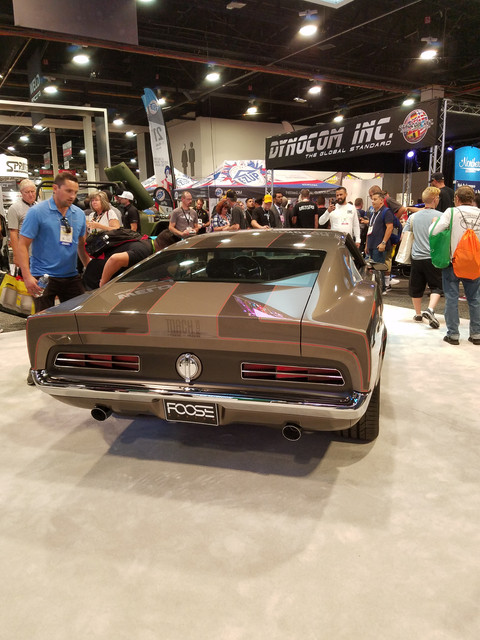
Foose's car... not so much - especially, after seeing it done so much better.

 
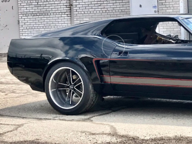
Wow thanks. Actually I knew from day one it was going to look like the Camaro in that area. It’s what you Get when you pillow instead of flair the quarter panel.My only concern about it was the colour flop that it does on certain angles. I’m fine with it regardless. Thanks again for the great complements


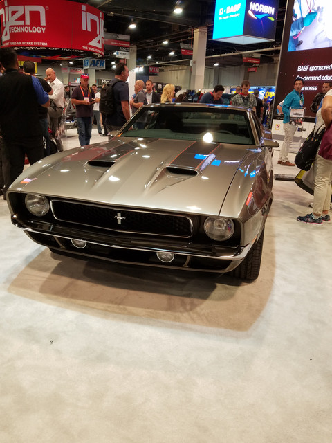
Not the best pic of the Mach Foose but the angle of the shots are similar. You can really see the difference of the front wheel moved forward and shortening the nose of the Foose build. Any thoughts? Is shorter a better look?
I think yours looks better with the longer nose!  It lets the car keep the 70's long hood look and makes the front spoiler look awesome!  Foose's car has more of a modern Mopar Challenger look to the front.  Don't second guess...your design looks perfect!!

 
As said on mach Foose's thread, its a very nice build, but its no longer a 7173. Line is gone. A 7173 with a short nose... tsss

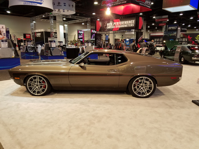
On your build, made with 7173 love, I asked you once what were the plan for the scoop behind door. Seeing it outside, with "environment" reflections other than the equal ceiling It is clear on the side, you have the back and then the rest starting at the door. Causing by the wide body starting right behind the door, but none of the curve going to the back present on the door.

So as this seams to bother you, and reusing the welding machine is out of order. May be you could either play/try with graphics on top of the door some satin/mat black to reduce reflections or as on this quick and dirty illustration, may be add something to the scoop so the attention goes to it and link optically the two parts of the body together... soon the door handle back, will also add to the balance/contrast.


I won't bother too much, its kicking ass as is, plus other road users will only see the rear quickly becoming a dot on the horizon!

Another option is to move to the Netherlands, its mostly a uniform grey sky over here :D

 
Fabrise your too funny. I do see what you mean. The odd angles in reflection is of course the price to pay for widebody. I’m cool with it. Your graphic creating the C stripe actually looks kind of cool. What I’m not cool with, however is that upon examining the car out the in the sun has revealed to me just how much the bodywork has shrunken in the last 4 months. I suppose I should have expected it since I was on a time crunch at my shop and didn’t allow for any settling. As it goes, I’m going to push it out into the hot sun through out the summer and repaint/ cut/ polish and graphic the back half of the car. My Bodyman says it’s not a big deal. It’s tearing me up inside. Oh well. If it was too easy everyone would be doing it.


Two more shots. All the detail is lost because of the suns glare so I had to play with it a bit to bring some contrast back.

 
To me it has this illusion of being two different cars because it looks slammed from the rear point of view and in the front facing view the car looks like the roof is not as slammed.

 
The raised quarters give it an aggressive look and an even sleeker look at the same time. Good job.

I like the longer nose, too. The short nose accentuates the longer distance from the door to the wheel well, making it look out of proportion, in other words, weird.

 
Last edited by a moderator:
I actually prefer yours compared to the Foose one. And that's saying something!!

And yes, I agree that the reflections make the quarters look "separate" from the rest of the car but I guess that's because of the mirror finish black paint. A silver color or something similar would probably not have had that effect.

But it's not really an issue.

Like they say in Germany: were complaining on a very high level. :)

Bottom line is, if it ever starts bugging you, I'll take it. :)
Wow. That really is saying something. I hope I get it on the road by next year. In order to keep it affordable I have to spend serious time on it. The balance between this project and the rest of my life is often a challenge.

 
boom!!! Now i can follow on here too : )
Lol. Cool thanks for caring. It will be a few months before I get to play again but I’m itching to get going. I want it on the road for spring if things go as planned.


Not the best pic of the Mach Foose but the angle of the shots are similar. You can really see the difference of the front wheel moved forward and shortening the nose of the Foose build. Any thoughts? Is shorter a better look?

I like the depth at the front of yours! Just hope there’s not too many speed humps where you live haha

Sent from my iPhone using Tapatalk

 
Last edited by a moderator:
Yours actually looks like a 7173 Mustang. A very badass version I might add, but it still is that body style. Foose's car is unique, but in my mind it is a Frankenstein, not a 7173 anymore. Your customizations tweak and enhance the main styling elements without becoming something else. I like what you did to the front end. Sometimes less is more, you know?

Scott

Scott

 
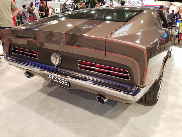
I like the looks of yours much better. I think the rear of the car looks amazing. I like the wide stance and the accentuated transition between the rear pilar and fender. I love the black with gray accent as well.

I saw the Foosestang in person. I hate the rear of the car.

Here are more pictures:


It still has a 71-73 look from this angle:


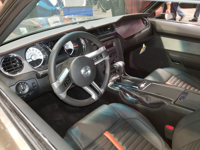
New Mustang interior look:


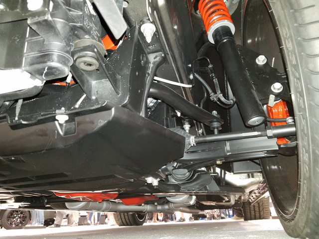
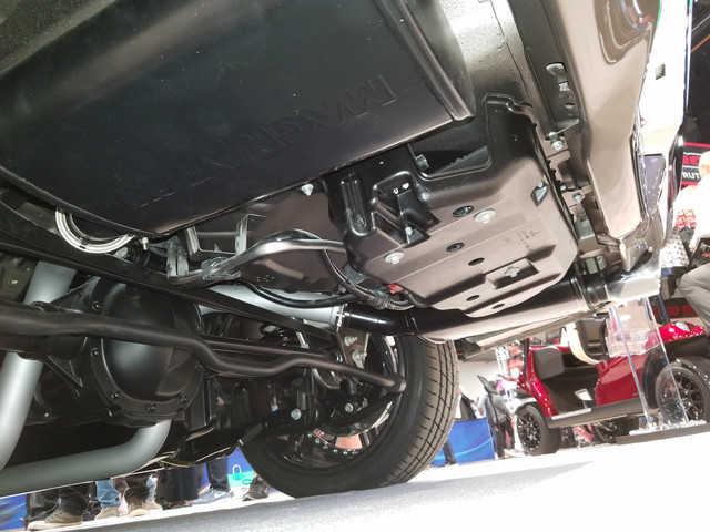
Notice the small gas tank:


Edit: Another overall pictures:


Last edited by a moderator:
Ahhh buddy. She’s going to get resprayed. I’m doing a complete flip to a white with black accent paint scheme. My first idea. Go with your gut lol. I’m in no rush. I want it to be great. Thx.

 
Back
Top